

Donald Trump Makes Covers Great Again


When Donald Trump was elected president of the United States at the end of last year, magazine cover designers struck gold. We can safely say that Trump was the cover model of 2017. Art director Jaap Biemans has made a selection for Villamedia of the most striking Trump covers from all over the world.
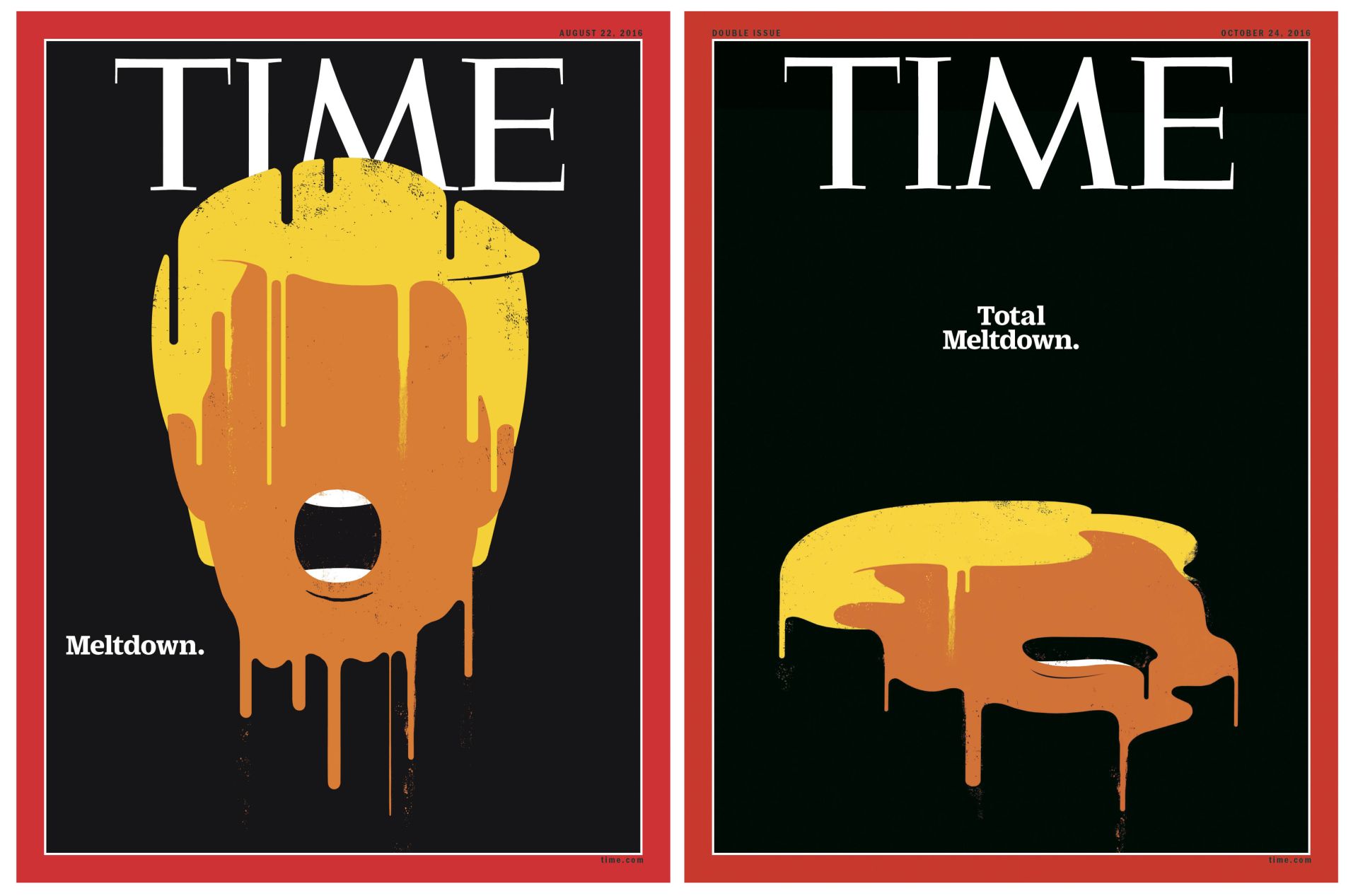
It was the artist Edel Rodriguez who at the end of last year gave the starting shot for a parade of highly talked about Trump covers. The melting head of the then presidential candidate, followed a few weeks later by a completely melted version, caused a great deal of oohs and aaahs in the magazine world. ‘Prior to this there had already been other covers with Trump on it, but they were fairly polite,’ says Jaap Biemans, art director of Volkskrant Magazine and the man behind the website Coverjunkie.com. ‘But from that moment on it really took off.’ Although not in the Netherlands, we should point out. At the Mercur Awards this year new life will be breathed into the Cover of the Year category, but there is not one notable Trump cover. Biemans, in Trumpian vocabulary: ‘Weak! Losers! Zero! Disaster!’
(Prefer to swipe? Click on our carrousel in the top left corner.)
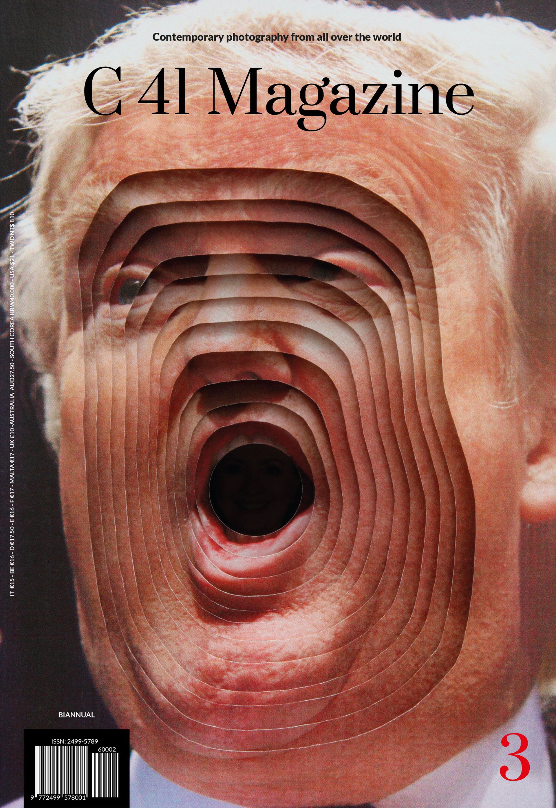
‘My favourite. This cover has it all. Spectacular. This is true craftwork that has used the properties of paper. It emphasizes Trump’s ugliest feature – his mudslinging mouth – in a very arty fashion. This is contemporary art made for a magazine cover. Because of it, the magazine – which I had never heard of until then – received a thousand times more exposure than it ever had before.’
© C41 & Kensuke Koike
‘Funny, slightly rebellious magazine that has played around with the logo. They changed GOOD to OGOD. A clever idea. You can see Trump faintly in the background. A 10 for daring.’ © GOOD magazine
‘The image is actually too small – I don’t understand this – but it is very fresh, very now. What I like is the dummy in the shape of America. And the idea, of course, that Trump is a big baby.’ © Suddeutsche Zeitung & Craig&Karl
‘Subtle art that leaves something to the imagination. It is almost poetic. You only really see two holes in a sheet. But the message is clear, without actually putting the KKK pointed hat onto Trump’s head. That would have been too easy.’ © The New Yorker & David Plunkert
‘This came out at Halloween. I think it’s good when you can connect something topical with a news item. And it’s funny that this clown actually looks like Trump. The great promise to cartoonists when Trump was elected – that they would have fun – can be seen in this type of cover.’ © The New Yorker & Garter Goodrich
‘This one is far too explicit for me. And from Germany, even. When I received this I did ask them: aren’t you going to get into trouble for this? But the editorial staff had made a well-considered choice. And it did cause a commotion. I personally find it tasteless to compare someone with a man who killed 18 million people. Regardless of what you may think of him.’ © Stern & Derik Meinko & Michel Lengenfelder
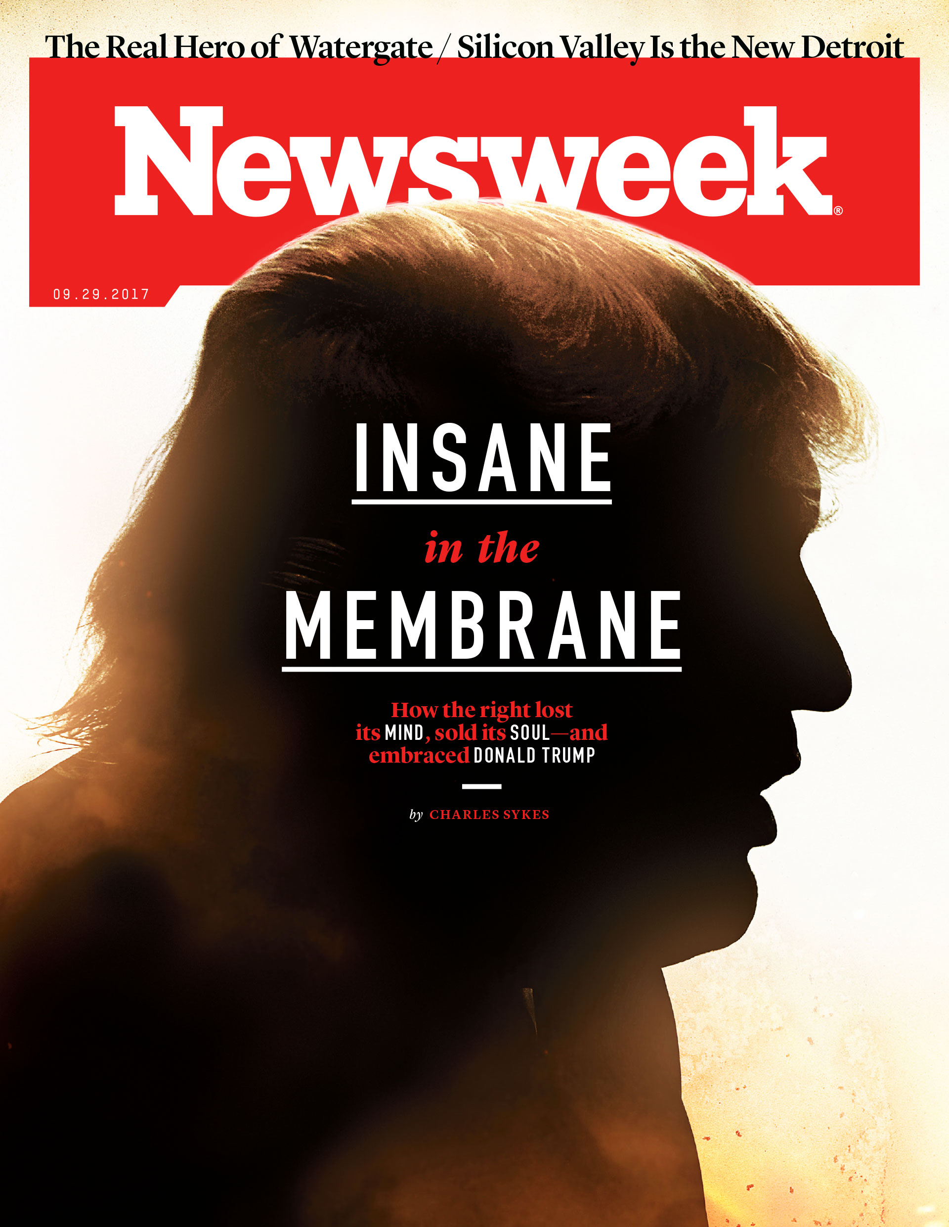
‘Yes, Cypress Hill! This is interesting because it refers to those classic song lyrics. Aesthetically it looks very good, with that shadow on his head. You actually only see a silhouette.© Newsweek
‘This was published at a time when the face-off between Trump and the North Korean leader Kim Jung Un reached its high point – or low point. The combination of faces is very effectively. You can also do it the other way round; Kim’s hair and Trump’s mouth. I wonder what that would look like.’ © Libération & Guillame Titus-Carmel
‘That self-satisfied smirk of Trump, and then dressed like former president George Washington. I love to hate the covers of The Economist; they are often carried out so clumsily. But not here; this is good in every respect. It looks like an oil painting.’ © The Economist
‘A few months into Trump’s presidency the moment came when people began asking themselves: what’s really going on? Not much actually. He was only playing golf and lashing out at those around him, whilst sinking further into the swamp. You can see this here. A fantastic Trump cover, without actually seeing the man himself.’ © The Economist
‘This one has a surprising twist, albeit a subtle one. Each year on its anniversary, The New Yorker puts its mascot, Eustace Tilly – a dandy with top hat and magnifying glass – on the cover. And then do something funny with it. It’s a tradition – The New Yorker has been around for more than a century. This year they had turned their mascot into Putin, with Trump represented as a butterfly under scrutiny. And look at ‘The New Yorker’ in Russian above it. As far as I know, this is the first time the logo has been altered. And yet it’s recognisable, which is bizarre. I only noticed that after looking three times.’ © The New Yorker & Barry Blitt
‘I was shocked by this. I had never seen anything like this on a cover. If I were the art director of Der Spiegel I would have said: perhaps we shouldn’t do this. What I find interesting is that two things are combined here: ISIS and Trump with his symbol of the free America. But it is too literal for me; I usually look for a solution where the image complements the text rather than literally reflects it.’ © Der Spiegel & Edel Rodriguez
.jpeg)
‘This makes my hair stand on end, but from fear. The all-consuming gluttony bearing down on the world. Very well illustrated.’ © Der Spiegel & Edel Rodriguez
‘I had seen this image somewhere before it ended up on a cover, and actually put it on my Coverjunkie Instagram. It had the most likes ever. What’s so clever is all those disgusting slices of luncheon meat. It’s amazing that people recognize Trump in this. It became a hype on social media. This Spanish culinary magazine later put it on its cover.’ © Tapas & Asier Sanz Nieto
‘This is what we all think he’s like; a bored, fat old man who doesn’t quite know what to do, and thinks: who can I piss off today? Well illustrated.’ © Newsweek
‘Every aspect of this Banksy spoof is good. What’s interesting about this cover is that it appeals to both Trumps supporters as well as his adversaries. An angry, white old man who rages against the establishment. A rebel in the White House.’ © The Economist & Miles Donovan
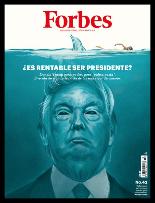
‘A totally different approach, ten steps too far if you ask me. Imagine the brainstorming session: we are going to depict Trump under water, something with a shark and a wisp of hair. Whatever made them think of that? And yet it has turned out quite captivating.’ © Forbes & Jared Yamahata
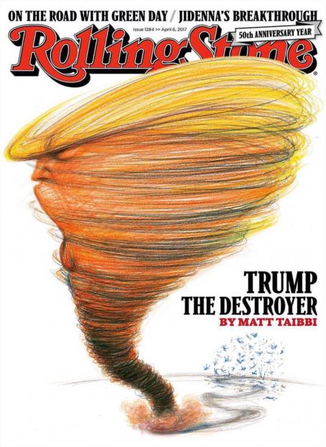
‘If you look closely, you can see they’re just scratches, and yet you see Trump in it. I have never seen Trump depicted as a tornado. Original.’ © Rolling Stone & Victor Juhasz
‘There is a storm raging, and Trump says: nothing to worry about. Beautifully drawn, especially his hair.’ © TIME & Tim O’Brien
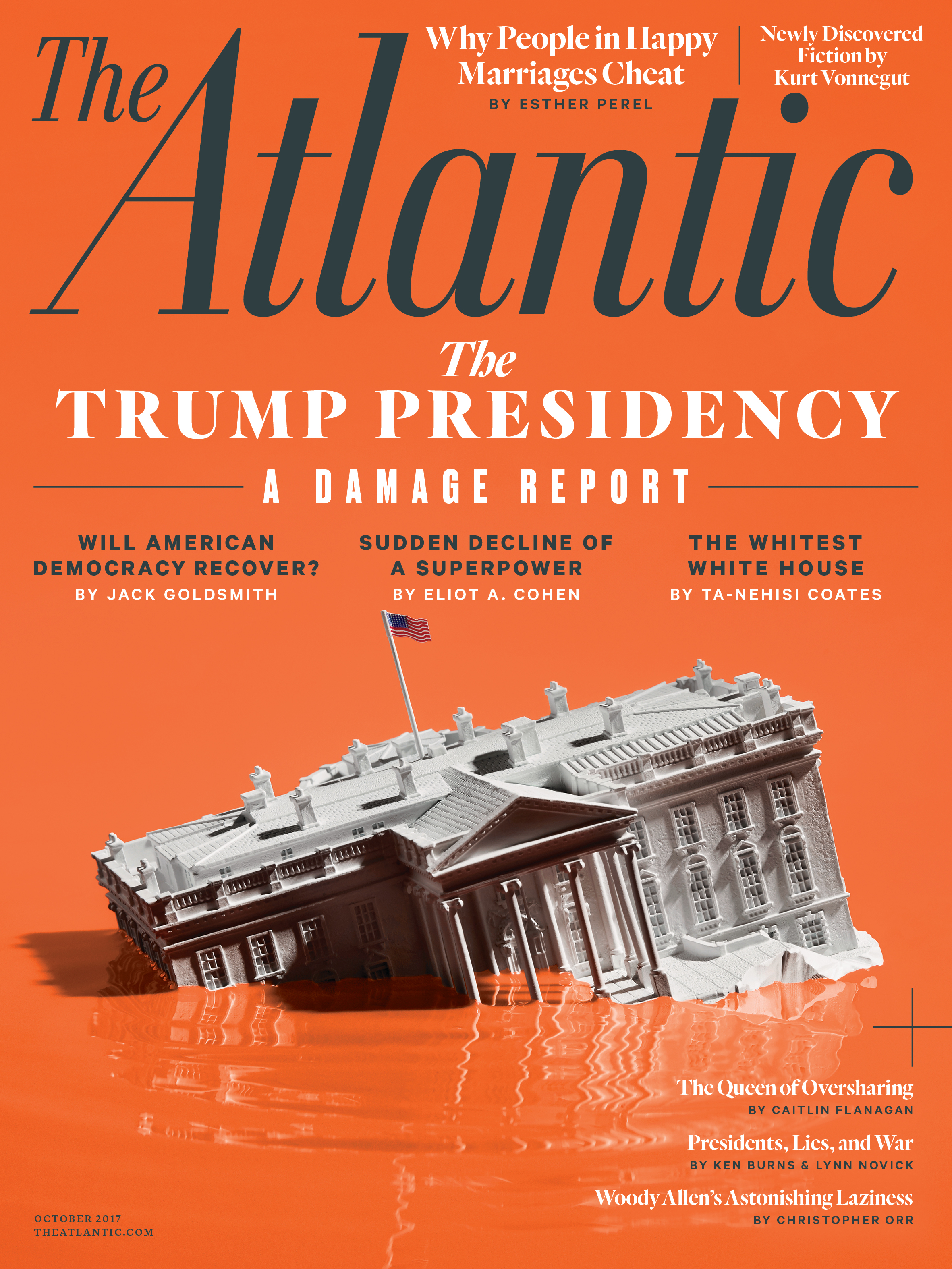
‘This is almost a typography lesson. The lines, that black, and the stylish font. Everything is good about it. It almost looks like a film poster. In general there is very little attention given to that on covers, especially in Dutch magazines.’ © The Atlantic
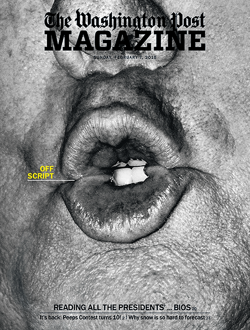
‘What’s so wonderful about this one is that when you look at it, you think: is this his mouth or his arse? It’s ugly in every possible way, truly hideous. Very well done, because it takes precision to frame it just right.’ © Washington Post Magazine
‘An intriguing Trump cover, but without Trump. The atmosphere is so threatening and graphically so strong that it hurts.’ © IL Magazine
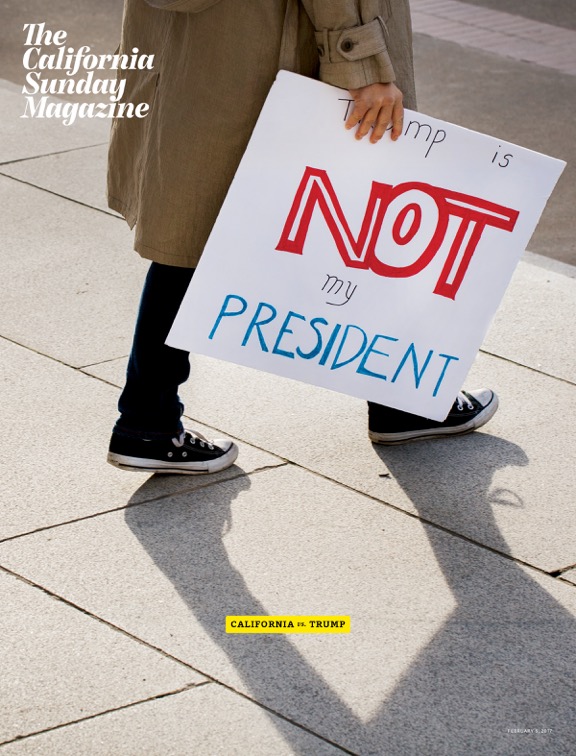
‘The way it has been framed is strange, making this cover intriguing and highly aesthetic. Your eyes are drawn to what is written on the sign. This cover shows some optimism, the only one in this series to do so.’ © California Sunday Magazine
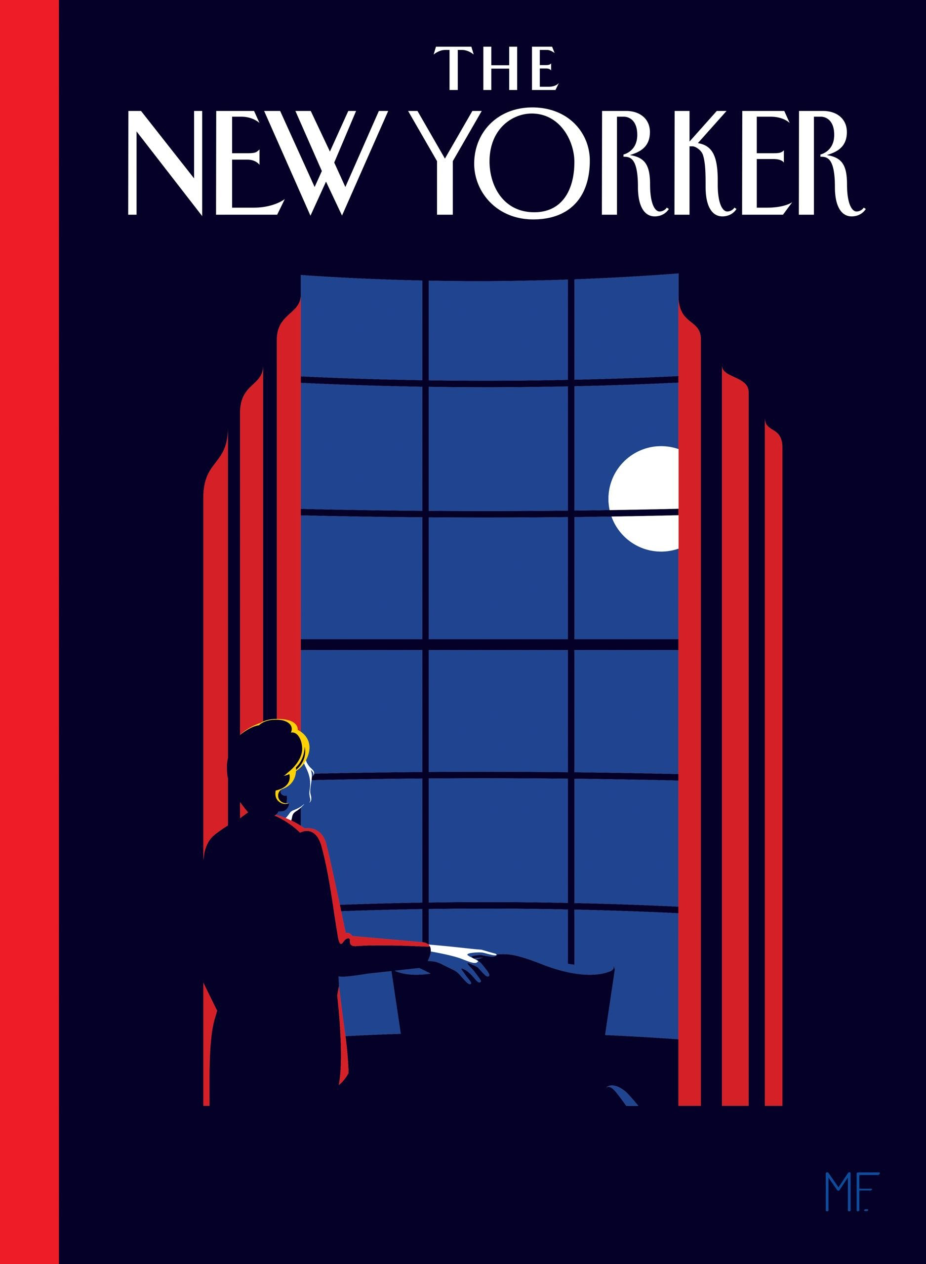
‘Very attractive. So serene. The illustrator who made this works with a few solid colours and always manages to hit exactly the right tone. This cover was never published. It was the backup for if Hillary Clinton had won the election. It really hits the nail on the head in terms of atmosphere, and shows the difference between Clinton and Trump. The serenity contrasting with all that craziness and hysteria.’ © The New Yorker & Malika Favre
‘This was: wow! Simply extraordinary that TIME dared to do this. And also that they made a follow-up cover two months later. You hardly ever see that. Plus it’s difficult to draw a melting head. After all, it has to look like the person.’ © TIME & Edel Rodriguez
Click here for the Dutch version of this article.
Translation: Newton Translations
Praat mee